
Data Visualization is very important part of data science. It helps to explain our data to others. It helps us in understanding our data well. Without data visualization it is difficult to get insights of the data.
So let’s get started with data visualization. Matplotlib is go to library for data visualization. Let do some basic plots with matplotlib in python.
Line Plot
import matplotlib.pyplot as pltx = np.arange(-10,10,0.1)
plt.plot(x,norm.pdf(x))
plt.savefig(fname = 'line_plot.png')
plt.show()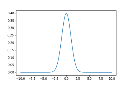
Multiple Plot on a Graph
x = np.arange(-8,8,0.001)
plt.plot(x,norm.pdf(x))
plt.plot(x,norm.pdf(x,2,1))
plt.savefig(fname = 'multiple_line_plot.png')
plt.show()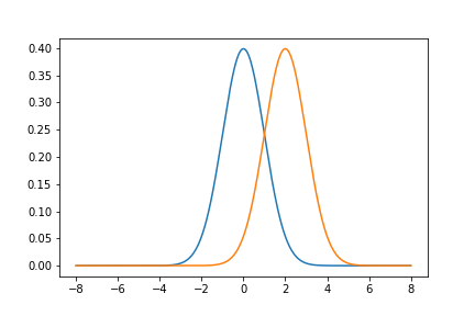
Histogram
x = np.random.normal(10,20,10000)
plt.hist(x,50)
plt.savefig(fname = 'hist_plot.png')
plt.show()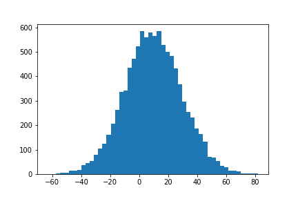
Scatter Plot
x = np.random.rand(40)
y = np.random.rand(40)
a = np.random.rand(40)
b = np.random.rand(40)
plt.scatter(x,y)
plt.scatter(a,b)
plt.savefig(fname = 'scatter_plot.png')
plt.show()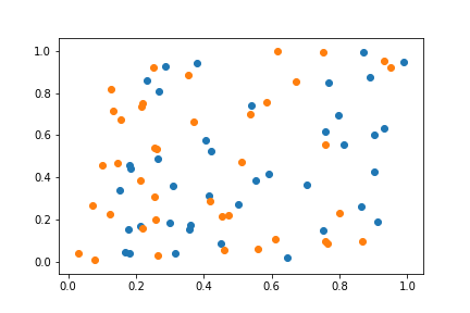
Adjust Axes
axes = plt.axes()
axes.set_xlim([-300,1000])
axes.set_ylim([0,500])

x = np.random.normal(0,50,1000)
y = np.random.normal(500,100,1000)

axes.set_xticks(range(-300,1000,100))
axes.set_xticklabels(range(-300,1000,100),rotation = 45)
axes.set_yticks(range(0,500,100))

plt.hist(x)
plt.hist(y)
plt.savefig(fname = 'adjust_axes.png')
plt.show()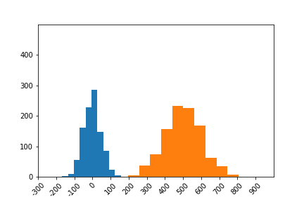
Adding a Grid
x = np.arange(-8,8,0.001)
plt.plot(x,norm.pdf(x))
plt.plot(x,norm.pdf(x,2,1))
plt.grid()
plt.savefig(fname = 'grid.png')
plt.show()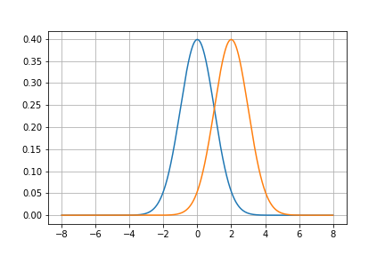
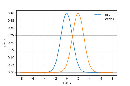
Labeling And Legend
x = np.arange(-8,8,0.001)
plt.plot(x,norm.pdf(x))
plt.plot(x,norm.pdf(x,2,1))
plt.xlabel('x-axis')
plt.ylabel('y-axis')
plt.legend(['First','Second'])
plt.grid()
plt.savefig(fname = 'grid.png')
plt.show()